A small multiple with gaps shows the rough geography of the 33 boroughs of London. The square symbols contain data about each borough.
SUMMARY
Data collection is becoming ubiquitous: from smart phones and watches to large businesses and governments. However, collecting data is only a first step: we need to make sense of data through analysis, to extract knowledge and patterns from it, so that we can learn, reflect and improve knowledge and processes. By visually representing data we can identify broad structures and subtle nuances that help with this process. Visual analysis can benefit both from a computer’s incredible abilities to deal with number as well as a human’s experience, interpretation and intuition. In ALGOVIS we are developing ways of producing graphics of data to help people in their analysis of numbers. We use geometry and computation to present numbers in ways that allow people who study them to see structure and patterns clearly.
In many cases, data have a geographic context, such as the country, county or location to which the data relate. There are various techniques to show such data on geographically accurate maps – weather maps are an example. These are appropriate for showing geographic processes that change dynamically and for navigation and planning. Equally techniques exist for showing data entirely without geography, if the statistical properties of the data are deemed to be more important than where the data were recorded. Bar charts and bubble plots are examples. However, the middle ground of spatially informative graphics – visualizations that show data in a “roughly geographic way” so that we can consider statistics and geography concurrently – is under-explored, with only a few techniques developed in a somewhat ad-hoc manner.
In this project, we set out to combine visualization design with algorithmic rigor, to get a better understanding of what it means to show data in a spatially informative way that is “roughly geographic". We are developing techniques that retain important characteristics of geography in these rough maps and using computers to explore the extents to which this is possible given different characteristics and data sets and to create these maps automatically.
Algorithms that inform visualization - ALGOVIS
MAIN RESULTS
The current primary result of this project is a better understanding of the spatial deformations that happen in spatially arranged small multiples. In such a “small multiples map” or “grid map”, each region of interest is represented using a simple rectangle, functioning as a container for other statistical (often nongeographic) visualization. These rectangles are the small multiples, and by arranging them in a roughly geographic way, we obtain spatially informative visual representations. By collecting and developing various metrics to capture aspects of geography (displacement, shape, topology, etc.) and measuring and optimizing these on a large variety geographic regions, we were able to establish relations between them and analyze manually crafted layouts for a sense of priority among the metrics. In particular we also looked at cases where there is more space for the rectangles than strictly necessary – that is, empty rectangles or “gaps” are used to increase the spatial fidelity of the small multiples array.
At the start of the project, we reviewed the existing research and example maps and graphics and decided to focus on the “small multiples with gaps”, as described above.
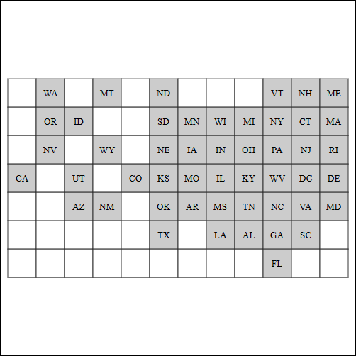
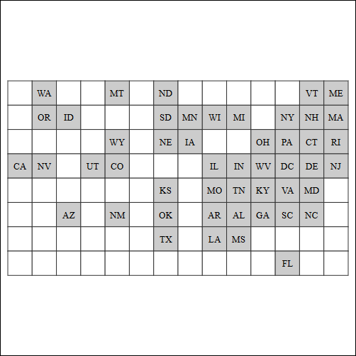
Geographic map of the USA, alphabetically ordered small multiples of the states and small multiples with gaps showing states in a roughly geographic formation that is more spatially informative.
We looked into ways of capturing the “spatially informative” characteristics of maps for this context – which aspects of geography might be important in our rough maps? We collected and developed metrics as well and produced tools to help us understand rough maps that retained these characteristics and the geographic distortions that occurred in our solutions.
Three grid maps of the contiguous states in the US (including DC), optimized according to different metrics, with very different spatial distortions: best shape, lowest displacements, fewest violations in compass directions between two states.
We used optimization methods to compute good layouts according to the various metrics, and see how these layouts compared to each other. We explored the way that these results varied as we increased the number of gaps to vary the degree to which the layout is consistent with the original geography and thus “spatially informative” vs. able to use the visual space to show additional data.
Roughly geographic grid maps of the states of the USA using small multiples an increasing number of gaps. The spatial distribution of states becomes clearer, at a cost of smaller cells and less cohesion in the map.
Our interactive software, graphical annotations and animation transitions allowed us to assess qualitative and quantitative differences and relations between the metrics. Moreover, by using a similar approach on hand-crafted maps, we were able to determine a priority among these metrics.
We have presented this work at international conferences and provided software and examples that show the effects of generating small multiples with gaps in a whole range of maps.
Beyond this main research, we have been taking the first steps towards a study to investigate how spatial distortion affects the interpretation of spatially informative visualization, and how our annotations and transitions help to build understanding of these. This is supported by algorithmic work about describing good transitions or morphs between grid maps and their original geographically accurate layout.
Smooth morphing from a geographic map of historical Irish counties to a small multiple with (few) gaps.
Moreover, we are looking into ways of using these small multiples with gaps to build an effective trade-off between structure and space when visualizing sets that relate the various regions. For example, can we show a map of the countries of Europe and show which are the EU member states, the Eurozone countries, the Schengen countries, countries that qualified for the European Football Championships, etc.
We want to be able to see all of these relationships at the same time, concurrently with some spatial aspects of the data. We have made some progress, with preliminary designs and computational methods to achieve them.
Using small multiples with gaps to show set membership with rough geography. Here European countries are associated geographically through a small multiple with gaps and with coloured lines that show membership of four different groupings or sets.
The work described above is to continue after the project’s end, and we have set up our research questions for further investigation.
PROGRESS
The idea that a geographic region (country, county, state, etc) can be represented using a simple square container, which can then be filled with extensive graphics to illustrate more data about the region, is a special case of small multiples. Automatic algorithms that make the small-multiples layout be informed by space have solely focused on layouts with as few gaps as possible. And yet manually designed layouts, popular in many online news and analysis outlets, use gaps extensively to make the layout more intuitive and more closely reflecting the actual geography. However, there is little understanding about how these gaps help improve the layouts, and what it really means in the presence of gaps to have a good layout.
Our work provides new metrics that allow us to study small multiples with gaps, and tools and guidelines to support their analysis and production. We expect this to lead to better, more informed design choices for this popular visualization technique, allowing more accurate assessment of spatial patterns in data. In a broader sense, our work advocates and takes advantage of the use of position as a means of carrying information in situations where its use may subtle but powerful. And it emphasizes the benefits of using a systematic and algorithmic approach to inform visual design.
WEB SITE
Digital resources including explanations, reports, research papers, movies, images, prototypes and code are available from the ALGOVIS web site :


