Virtual Water OD Map

giCentre alumnus, contributor, friend and Tableau guru Rob Radburn has been using OD Maps to make sense of spatial flows.

You can see the revealing maps on Rob's Tableau Public page: Virtual Water - The unseen flow of water across America through agriculture

OD Maps are a great way to make sense of spatial flows and the way in which such flows vary spatially through maps showing information at two scales concurrently. Have a look at our featured paper that explains them: Visualisation of origins, destinations and flows with OD maps

odMap.waterFlows.png

giCentre @ IEEE VIS 2017

We have 3 InfoVis, 3 VAST, 1 TVCG, and 2 CG&A papers that will be presented at IEEE VIS 2017 in Phoenix early October. We also have 2 InfoVis posters, one of which was awarded Best Poster Honorable mention, one award winning VAST Challenge entry. We are also involved with a panel on design studies, the BioVis Challenge, and the Velo Club de VIS Meetup and bike ride.

The full list of our contributions, pre-prints, data sets, movies and other materials are available for download at our vis2017 page.

Research Grant Success

Cagatay Turkay has been awarded a prestigious grant by The Engineering and Physical Sciences Research Council (EPSRC) under their First-Grant scheme. The funding is for the project titled “NlViS: Natural Language Interaction for Visual Data Analysis” that will commence September 2017 for a duration of 18 months until February 2019.

The project will investigate ways to advance exploratory data analysis methodologies through novel combinations of interactive visualisations and natural language understanding. The project will be asking fundamental questions on how analysts make inferences from visual representations to develop an in-depth understanding of how exploratory visual data analysis processes are executed. Further details of the project can be found on the project page.

Rewiring science-policy with visual information design

Jason Dykes has co-authored a piece on the role of visualization in developing policy from scientific findings with Owen Gaffney of the Future Earth Media LabGreg McInerny of the University of WarwickDenise Young of the International Council For Science and Marian Dörk of Potsdam University of Applied Sciences.

The article presents arguments for increasing communication between scientists policy makers and designers and supporting mechanisms both for achieving this and developing visual literacy. It contains links to some interesting visualization examples.

The ideas came out of Greg's excellent multi-disciplinary EcoViz working group on science, technology and design.

Prize for Pressing Poster

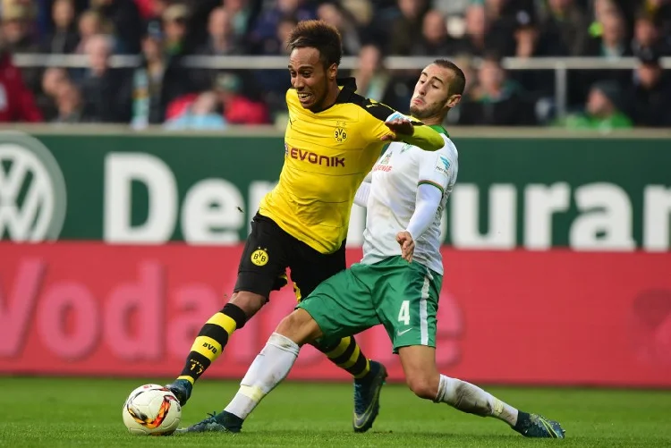
As Juergen Klopp's high tempo counter-pressing strategy shoots Liverpool FC towards the top of the Premier League, Gennady and Natalia have been awarded the Best Poster Award at VAST 2016 for their work on Exploring Pressure in Football.

Their collaboration with the DFL (Deutsche Fussball Liga) generates new statistics on pressing and visualizes these as they evolve through a match and across the pitch. The graphics enable football analysts to interact with the data and explore the patterns of pressing - with Klopp's former charges at Borussia Dortmund the focus of some of the Andrienko's research.

A full paper describing the work has been conditionally accepted for the journal Data Mining and Knowledge Discovery and should appear early next year. By which time, Liverpool may be flying even higher in the league table?

Tour de TypeFace

A few of us headed to the Ditchling Museum of Art+Craft to see the  Underground Exhibition on Edward Johnston's calligraphy.

We cycled as a nice day was forecast and it's and National Cycle Challenge month and CITY has entered.

We took in much of the London-Brighton route, enjoyed high tide and stormy seas along the Undercliff between Brighton and Rottingdean and ended up at the beach in the evening.